Data Visualization for Visually Impaired
Online data visualizations are commonly used on the web to effectively communicate large volumes of data. Additionally, visualizations assist users in extracting information efficiently, helping people make informed life decisions concerning their health, finances, and activities.
Description
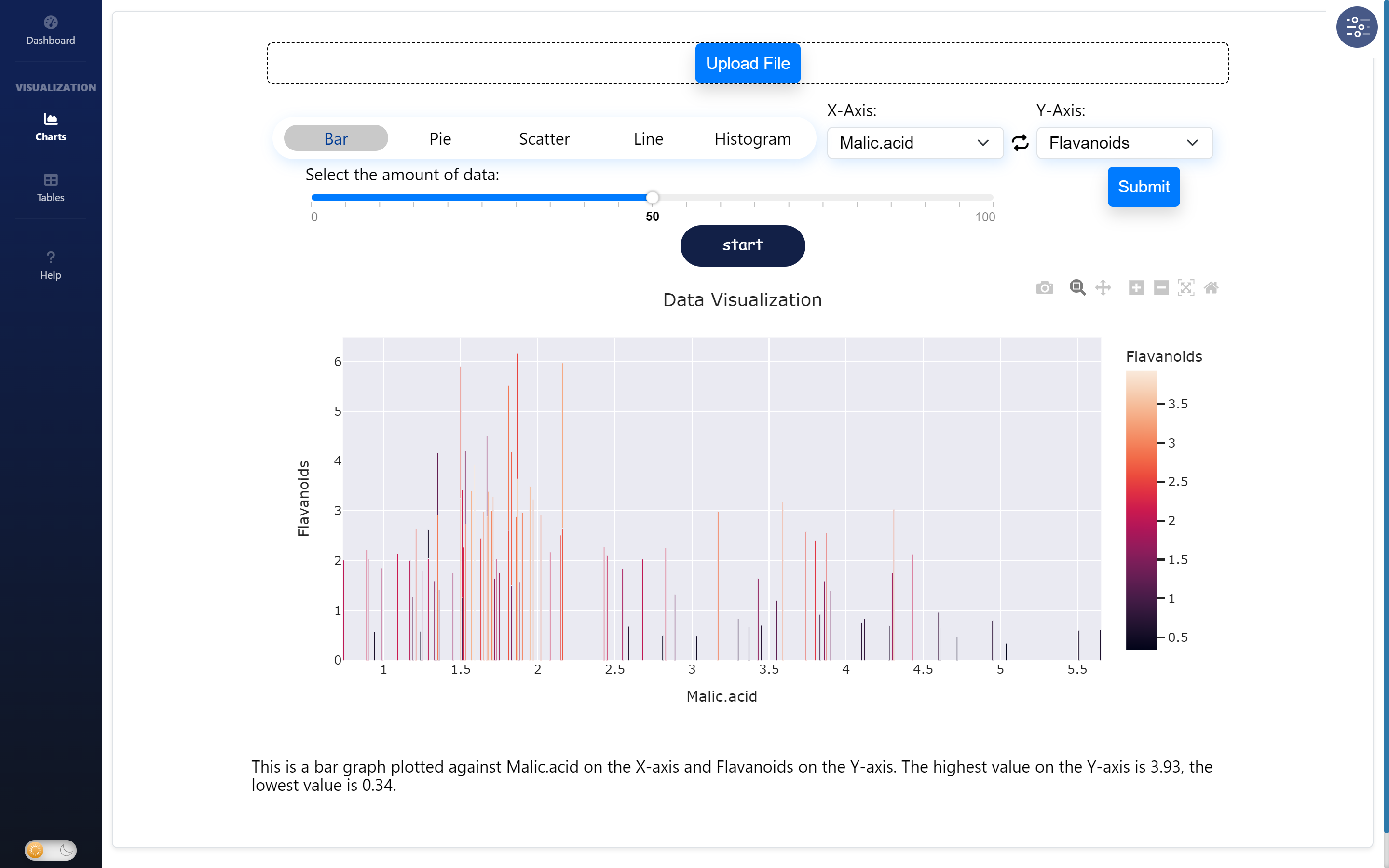
Recent work in politics, health, finance, and business analytics indicate the importance and wide adoption of online data visualizations. However, the essential visual nature of data visualizations inherently disenfranchises people who cannot see. These people include people who use screen readers to read the contents of their computer screens. In contrast, non-screen-reader users can explore data visualizations by rapidly interpreting visual patterns. Prior work has reported that alternative textual descriptions ("alt-text") for visualizations are often missing. In cases when alt-text is present, screen-reader users (SRUs) spend 211% more time and are 61% less accurate in extracting information than their non-screen reader user counterparts. Therefore, it is essential to find ways to make online data visualizations more accessible, efficient, and usable to screen-reader users (SRUs). Several prior works have attempted to improve the accessibility of online data visualizations, such as by auto-generating alt-text and enabling verbal information extraction. While these tools contribute to the accessibility of online visualizations, they either focus on simple graphs (e.g., single-series bar graphs) or the extraction of mainly high-level ("holistic") information, such as extrema and averages. Therefore, their granular ("drilled-down") interactions, such as extracting and comparing data points, especially with complex visualizations, remain unexplored.